
Problem
A new rideshare company entering the Chicago taxi market needs to know where to compete, not just that competition exists. Raw trip data from November 2017 reveals a market that looks open on the surface but is heavily concentrated in practice — a handful of companies dominate volume, and a small number of neighborhoods generate the majority of rides. For a business analyst, the challenge is turning that raw data into defensible claims: which companies lead, which drop-off zones matter most, and whether external factors like weather measurably affect the routes that matter. Answering those questions requires more than counting rows — it requires SQL to extract structured data, Python to analyze it, and formal statistical testing to move from "it looks like" to "the data shows." This project worked through all three layers to produce conclusions that could survive scrutiny.
Solution
The project used SQL queries to pull structured trip data from a relational database, then imported the resulting CSVs into Python for exploratory analysis and hypothesis testing. Exploratory analysis identified the top taxi companies by November 2017 trip volume and the most popular drop-off neighborhoods, surfacing Flash Cab's dominance and the Loop's outsized share of trips. The second phase formalized the weather analysis as a proper hypothesis test: the null hypothesis that rain and bad weather have no effect on average trip duration from the Loop to O'Hare was tested against the alternative. The result — t-statistic of 6.84, p-value approaching zero — rejected the null hypothesis with high confidence, confirming that bad weather adds a statistically significant 20.6% to average trip duration on that route. Framing the analysis as a hypothesis test rather than a visual observation is the difference between a claim and evidence.
Skills Acquired
- Python — the analysis environment for all data manipulation, visualization, and statistical testing after the SQL extraction phase.
- Pandas — used to load the SQL-exported CSVs, merge trips with weather condition data, filter for the Loop-to-O'Hare route, and segment trips by weather category for the hypothesis test.
- NumPy — used for numerical aggregations underlying the trip duration analysis, including computing means across weather-segmented trip groups.
- Matplotlib — used to visualize the top taxi companies by trip volume and the most popular drop-off neighborhoods, producing the charts that anchor the exploratory findings.
- Seaborn — used for distribution plots that compared trip duration across weather conditions, making it easier to see the spread before formalizing the hypothesis test.
- SciPy — provided the two-sample independent t-test (
ttest_ind) used to compare average trip durations on rainy versus non-rainy days. The t-statistic and p-value from SciPy's test are the statistical backbone of the project's central finding. - SQL — used to extract trip data, neighborhood drop-off counts, and weather records from a relational database. Understanding what the SQL queries were doing — joins, aggregations, filters — was part of being able to trust the data before analyzing it.
The story the data tells is more specific — and more surprising — than the headline numbers suggest.
Deep Dive
Chicago has hundreds of taxi companies operating on the same streets. On the surface, it looks like open competition — but data tells a different story. One weekend in November 2017, Flash Cab logged nearly 20,000 rides while most of the field was fighting over a fraction of that. And certain neighborhoods consistently absorbed far more traffic than others.
That's the EDA side. But this project went further: I also wanted to answer a question anyone who has hailed a cab to O'Hare has probably wondered — does bad weather actually make that ride longer? Not anecdotally. Statistically.
Why This Project?
Up to Sprint 7, most of my work was preprocessing and getting familiar with pandas. This sprint introduced a new workflow: use SQL to pull structured datasets from a database, then bring them into Python for analysis. The SQL part was pre-executed — the CSVs were already waiting — but understanding what the queries were doing and why the data looked the way it did was part of the exercise.
More importantly, this was my first project built around a concrete business question rather than a dataset to clean. Rideshare's biggest competitor — taxi — runs on market share. Flash Cab's dominance, Loop's position as the prime dropoff hub, and whether weather adds measurable cost to airport trips are all things a product or ops team at a ride-hailing company would genuinely care about.
What I Learned
This was my first time running a formal hypothesis test — not just calculating a t-statistic, but thinking through the setup: what's the null, what's the alternative, what significance level makes sense, and what does "reject H₀" actually mean in practice. That framework carries into every project where I'm drawing conclusions from data.
What You'll Learn from This
- How to visualize and rank market data with horizontal bar charts — and why that specific chart type works here
- How to structure a hypothesis test from scratch: H₀, H₁, significance level, test selection, interpretation
- What a t-statistic of 6.84 and a p-value of ~0 actually tell you — and what they don't
- Why you clean outliers (like zero-duration rides) before computing statistics, not after
- The difference between statistical significance and practical significance — and why both matter
Key Takeaways
- Flash Cab dominated Chicago's taxi market with 19,558 rides on November 15–16, 2017 — nearly 2× the #2 company (Taxi Affiliation Services at 11,422)
- The Loop and River North were the top dropoff neighborhoods by a wide margin, concentrating most commercial taxi activity in Chicago's core business district
- Bad weather adds ~6.9 minutes (+20.6%) to a Loop-to-O'Hare Saturday ride — that's a statistically significant and practically meaningful difference
- t-statistic = 6.84, p-value ≈ 0 — the null hypothesis (no weather effect) was rejected decisively at α = 0.05
- Six rides with 0-second duration were caught and removed before analysis — a small but important data quality step
The Datasets
Three CSVs, each pulled from SQL queries against a Chicago taxi database. They covered two different scopes: market-level aggregates for the EDA, and ride-level detail for the hypothesis test.
Dataset 1
Rides per Taxi Company — November 15–16, 2017
64 companies, 2 columns: company_name and
trips_amount. This is total ride count over a single weekend — enough
to clearly see market concentration.
Dataset 2
Average Dropoffs by Neighborhood — November 2017
94 neighborhoods, 2 columns: dropoff_location_name and
average_trips. Monthly averages across all Saturdays in November —
smoothed out enough to show structural patterns, not just one-off spikes.
Dataset 3
Loop-to-O'Hare Saturday Rides — November 2017
1,068 rides, 3 columns: start_ts,
weather_conditions (Good / Bad), and duration_seconds.
This is the dataset for the hypothesis test. Weather was pre-classified — Good
meaning no precipitation/storm, Bad meaning rain, snow, or storm conditions.
The SQL Queries
The CSVs didn't arrive pre-built — I wrote the SQL queries that extracted them from a
relational Chicago taxi database. Three tables: trips, cabs,
and weather_records. Here are the key queries.
Query 1 — Dataset 1
Rides per Taxi Company
JOIN cabs to trips, count rides per company, filter to the Nov 15–16 weekend, and rank descending. This produced the 64-row CSV used for the EDA market analysis.
SELECT
    cabs.company_name,
    COUNT(trips.trip_id) AS trips_amount
FROM
    cabs
    INNER JOIN trips ON cabs.cab_id = trips.cab_id
WHERE
    CAST(trips.start_ts AS date) BETWEEN '2017-11-15' AND '2017-11-16'
GROUP BY
    cabs.company_name
ORDER BY
    trips_amount DESC
Query 2 — Market Segmentation
Flash Cab vs. Taxi Affiliation Services vs. Everyone Else
Used a CASE statement to bin every company into one of three buckets. This let me quantify top-2 dominance vs. the rest of the market without pulling every company name individually.
SELECT
    COUNT(trips.trip_id) AS trips_amount,
    CASE
        WHEN cabs.company_name = 'Flash Cab' THEN 'Flash Cab'
        WHEN cabs.company_name = 'Taxi Affiliation Services' THEN 'Taxi Affiliation Services'
        ELSE 'Other'
    END AS company
FROM
    trips
    INNER JOIN cabs ON cabs.cab_id = trips.cab_id
WHERE
    CAST(trips.start_ts AS date) BETWEEN '2017-11-01' AND '2017-11-07'
GROUP BY
    cabs.company_name = 'Flash Cab',
    cabs.company_name = 'Taxi Affiliation Services'
ORDER BY
    trips_amount DESC
Query 3 — Dataset 3
Loop-to-O'Hare Saturday Rides with Weather
The hypothesis test query. Joins trips to weather_records on timestamp, uses EXTRACT(DOW) to filter to Saturdays only (DOW = 6), pins pickup/dropoff to Loop (ID 50) and O'Hare (ID 63), and classifies weather inline with a CASE statement. This produced the 1,068-ride CSV used for the t-test.
SELECT
    trips.start_ts AS start_ts,
    trips.duration_seconds,
    CASE
        WHEN weather_records.description LIKE '%rain%'
          OR weather_records.description LIKE '%storm%' THEN 'Bad'
        ELSE 'Good'
    END AS weather_conditions
FROM
    trips
INNER JOIN
    weather_records ON weather_records.ts = trips.start_ts
WHERE
    EXTRACT(DOW FROM trips.start_ts) = 6   -- Saturday only
    AND trips.pickup_location_id = 50        -- Loop
    AND trips.dropoff_location_id = 63       -- O'Hare
ORDER BY
    trips.trip_id
Phase 1 — Exploratory Data Analysis
The EDA goal was straightforward: who owns Chicago's taxi market, and where do rides actually end up? Both questions get answered by sorting and visualizing the aggregates.
Part 1
Top 10 Taxi Companies by Ride Volume
After loading and inspecting the dataset (64 companies, no missing values), I sorted
by trips_amount descending and plotted the top 10 as a horizontal bar
chart. Horizontal bars work better than vertical here — company names are long, and
horizontal layout keeps them readable without rotation.
# Sort by trip volume and take top 10
top10_taxi = df_rides_per_taxi_company.sort_values(
    by='trips_amount', ascending=False
).head(10)

# Horizontal bar chart — company names stay readable
plt.figure(figsize=(10, 6))
plt.barh(top10_taxi['company_name'], top10_taxi['trips_amount'], color='salmon')
plt.gca().invert_yaxis()  # largest at top
plt.xlabel('Number of Rides')
plt.title('Top 10 Taxi Companies by Rides — Nov 15–16, 2017')
plt.grid(axis='x', linestyle='--', alpha=0.7)
plt.show()
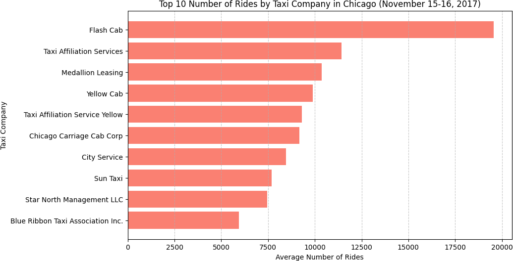
| Rank | Company | Rides |
|---|---|---|
| 1 | Flash Cab | 19,558 |
| 2 | Taxi Affiliation Services | 11,422 |
| 3 | Medallion Leasing | 10,367 |
| 4 | Yellow Cab | 9,888 |
| 5 | Taxi Affiliation Service Yellow | 9,299 |
| 6 | Chicago Carriage Cab Corp | 9,181 |
| 7 | City Service | 8,448 |
| 8 | Sun Taxi | 7,701 |
| 9 | Star North Management LLC | 7,455 |
| 10 | Blue Ribbon Taxi Association Inc. | 5,953 |
Flash Cab's lead is striking — 19,558 vs. 11,422 for second place. That's a 71% lead over the next closest competitor in a two-day window. Companies 2 through 6 are relatively clustered, but none of them are close to challenging Flash Cab. This kind of market concentration is worth flagging to any ops team thinking about competitive positioning.
Part 2
Top 10 Neighborhoods by Average Dropoffs
Same approach — sort by average_trips and visualize the top 10. The
neighborhood data used monthly averages across all Saturdays in November, which
smooths out week-to-week variation and gives a cleaner picture of structural demand.
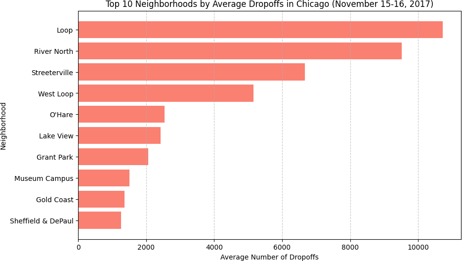
| Rank | Neighborhood | Avg Dropoffs |
|---|---|---|
| 1 | Loop | 10,727.5 |
| 2 | River North | 9,523.7 |
| 3 | Streeterville | 6,664.7 |
| 4 | West Loop | 5,163.7 |
| 5 | O'Hare | 2,546.9 |
| 6 | Lake View | 2,421.0 |
| 7 | Grant Park | 2,068.5 |
| 8 | Museum Campus | 1,510.0 |
| 9 | Gold Coast | 1,364.2 |
| 10 | Sheffield & DePaul | 1,259.8 |
The Loop dominates at 10,727.5 average dropoffs — more than River North, Streeterville, and West Loop combined would be if they were half their actual sizes. This is expected: the Loop is Chicago's central business district, where office buildings, hotels, and restaurants funnel traffic throughout the day. What's interesting is O'Hare sitting at #5 — the airport generates consistent demand even in November when tourism slows, largely driven by business travel.
Phase 2 — Hypothesis Testing
The EDA showed what Chicago's taxi market looks like. Phase 2 asked a more specific question: does bad weather make Loop-to-O'Hare rides meaningfully longer? This required a formal hypothesis test — not just eyeballing means.
Step 1
Define the Hypotheses
Before touching the data, I set up the hypotheses explicitly:
| Hypothesis | Statement |
|---|---|
| H₀ (Null) | The average duration of Loop-to-O'Hare rides is the same regardless of weather |
| H₁ (Alternative) | The average duration of Loop-to-O'Hare rides is longer in bad weather |
| Significance Level | α = 0.05 |
Setting α = 0.05 means I'm willing to accept a 5% chance of falsely rejecting H₀ (a Type I error). This is the standard threshold for most applied work — strict enough to avoid noise-driven conclusions, permissive enough to detect real effects with reasonable sample sizes.
Step 2
Inspect and Clean the Data
The dataset: 1,068 Loop-to-O'Hare Saturday rides. Three columns —
start_ts, weather_conditions, duration_seconds.
No missing values.
df = pd.read_csv('/datasets/project_sql_result_07.csv')

# Weather distribution
# Good: 888 rides (83.1%)
# Bad:  180 rides (16.9%)

# Split by weather condition
good_weather = df[df['weather_conditions'] == 'Good']['duration_seconds']
bad_weather  = df[df['weather_conditions'] == 'Bad']['duration_seconds']

# Remove rides with 0 or negative duration (data errors)
good_weather = good_weather[good_weather > 0]  # removed 6 rides
bad_weather  = bad_weather[bad_weather > 0]   # all 180 valid

# Final sample sizes
# Good weather: n = 882
# Bad weather:  n = 180
Six good-weather rides had a duration of 0 seconds — clearly data errors, not instantaneous trips. Removing them before computing statistics is the right call: including them would drag the good-weather mean down by a small amount, artificially inflating the apparent weather effect. The bad-weather group had no 0-duration rides.
Step 3
Descriptive Statistics
Before running the test, I looked at the raw statistics to understand the size and direction of the difference.
| Weather | n | Mean | Mean (min) | Median (sec) | Std Dev |
|---|---|---|---|---|---|
| Good | 882 | 2,013.3s | 33.6 min | 1,800.0s | 743.6 |
| Bad | 180 | 2,427.2s | 40.5 min | 2,540.0s | 721.3 |
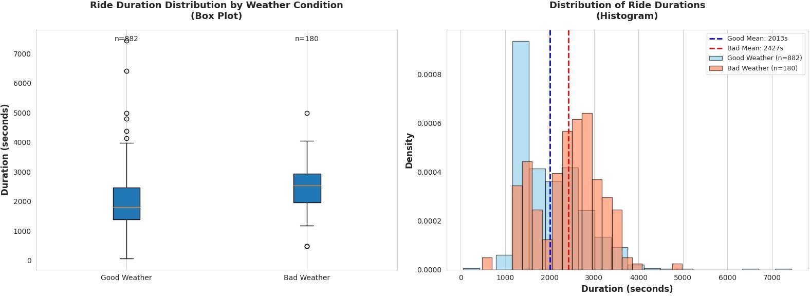
The difference is already visible: bad weather rides average 40.5 minutes vs. 33.6 minutes in good weather — a raw difference of 413.9 seconds (6.9 minutes), or +20.6%. But "looks different" isn't the same as "is statistically significantly different." With only 180 bad-weather observations, there's sampling variability to account for.
Step 4
The Test — Independent Two-Sample t-test
I used an independent two-sample t-test (Welch's via
scipy.stats.ttest_ind). The choice of test matters: an independent
t-test is appropriate here because the two groups — good-weather rides and bad-weather
rides — are separate, non-overlapping sets of rides. There's no pairing between them
(it's not the same rides measured twice under different conditions), so a paired test
would be wrong.
from scipy import stats

t_statistic, p_value = stats.ttest_ind(bad_weather, good_weather)

# Results:
# t-statistic = 6.8405
# p-value     = 0.000000  (essentially 0)

# Decision: p-value (≈0) < α (0.05) → Reject H₀
Final Results
| Metric | Value | Interpretation |
|---|---|---|
| t-statistic | 6.8405 | 6.84 standard errors separate the two group means |
| p-value | ≈ 0.000000 | Probability of observing this result under H₀ is essentially zero |
| Significance Level (α) | 0.05 | Standard threshold for applied data analysis |
| Decision | Reject H₀ ✓ | p ≪ α — sufficient evidence of a weather effect |
| Practical Effect | +6.9 min (+20.6%) | Bad weather adds nearly 7 minutes to the average Loop–O'Hare ride |
A t-statistic of 6.84 means the difference between the two group means is 6.84 times larger than the standard error of that difference — an extremely large signal. A p-value this close to zero means that if H₀ were true (no weather effect), seeing this result by chance would be astronomically unlikely. We reject H₀.
But statistical significance alone isn't the full story. The +20.6% increase matters just as much. For an airport trip, 6.9 extra minutes is the kind of difference that affects flight connection decisions and passenger planning. This isn't a tiny effect hiding behind a large sample — it's a real, meaningful impact.
Main Takeaways
- Flash Cab's market position is striking. A 71% lead over second place in a two-day window points to scale advantages, fleet size, or dispatch efficiency that competitors haven't matched.
- Chicago's taxi demand is geographically concentrated. The Loop, River North, and Streeterville together account for a disproportionate share of dropoffs — which is exactly where you'd want to prioritize fleet positioning.
- Weather has a statistically significant and practically meaningful effect on ride duration. t = 6.84, p ≈ 0. Not a subtle finding — this is strong evidence.
- Data cleaning before statistics, not after. Six zero-duration rides were removed before any statistics were computed. The order matters — post-hoc cleaning introduces selection bias.
- Statistical significance ≠ practical significance. Both the t-test result and the +6.9-minute effect size tell different parts of the story. An effect can be statistically significant but trivially small. Here, both dimensions point in the same direction — meaningful.
Conclusion & Reflections
This project was a different kind of exercise than the ML sprints that followed it. There's no model to optimize, no F1 score to chase. The entire value comes from asking a precise question, setting up the right test, and interpreting the result honestly — including both what it means and what it doesn't prove.
Rejecting H₀ doesn't mean weather causes longer rides. It means the data is inconsistent with the claim that weather has no effect. The mechanism — slower traffic, more cautious driving, higher demand — is something we infer from context, not from the test itself. That distinction between statistical inference and causal explanation is something I carry into every analysis now.
Growth into Sprint 8
Sprint 7 was about asking the right question. Sprint 8 moved into prediction — building my first classification model. The habit of thinking carefully about what a number means (t-statistic, p-value, F1) before drawing a conclusion carried forward directly. So did the discipline of separating data exploration from final reporting.
| Project Requirement | Status |
|---|---|
| EDA: top taxi companies visualized | DONE — horizontal bar chart, top 10 ranked ✓ |
| EDA: top dropoff neighborhoods visualized | DONE — horizontal bar chart, top 10 ranked ✓ |
| Hypothesis test with significance level α = 0.05 | DONE — t-test, p ≈ 0, H₀ rejected ✓ |
| Data cleaned (zero-duration rides removed) | DONE — 6 rides removed pre-analysis ✓ |
| Conclusion stated with justification | DONE — statistical + practical significance discussed ✓ |
Want to See the Full Notebook?
The complete code — EDA, visualizations, hypothesis test, and interpretation — is on GitHub.